Please visit dektop site to view this case study


Context
Maximising conversions with optimised payment page
Fynd Platform is a sas application that allows users to create their e-commerce store within minutes with 70+ live brands along with other Jio Reliance Brands. Redesigning Fynd platform’s checkout page for Improved success rate, consistency, better user experiences and greater conversions
70+
Active Brands
10+
Payment Options
30,000+
Monthly Transitions
Fynd platform is a SaaS application that helps businesses create
E-commerce store and manage it. Since it dictates the user experience of checkout and payment pages for all the brands hosted. It is essential for these pages to provide the best UX for higher conversion rate while still being customisable for different needs of the brands
It started when we noticed complains about transition failure related to some specific cart network. According to a report 42% customer never returns to a website or app after a falsely declined payment. Which is a big hit on customer acquisition cost. In 2022 businesses lost between 1% and 2.1% of their revenues due to inadequately optimised payments acceptance
Project Info
Duration: 1 Months
Category: E-commerce feature enhancement
My Role
Mentored 1 designer and managed his work
Collaborated with product managers to analyse payment failure patterns, studied google looker board
Implemented UX improvements, leading to a 12% increase in transaction success rate and higher revenue
Problem Statement
What changes can we make to the payment page to improve conversion and reduce failed payments?
I focused on understanding the parts of the payment page which was leading to complains and failed transitions, improvements that could be made and business expectations
Along with the product manager we analysed google looker board and used the insights to identify issues to build solutions that address these problems effectively
We identified these are the most common problems with the payment page:
High payment failure rate due to poor error handling
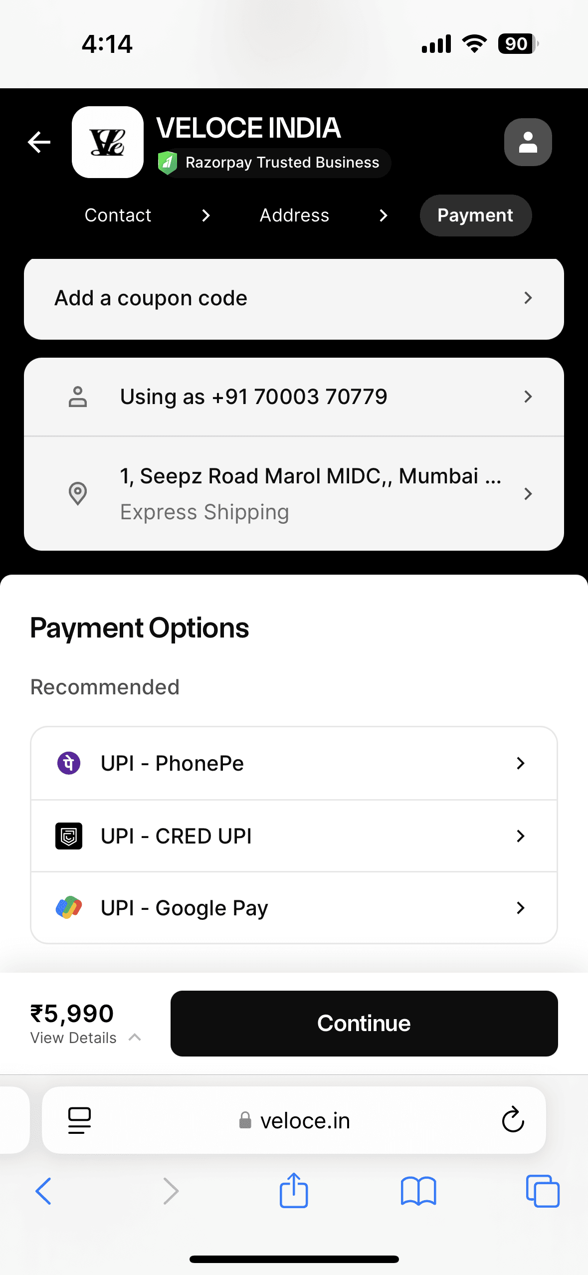
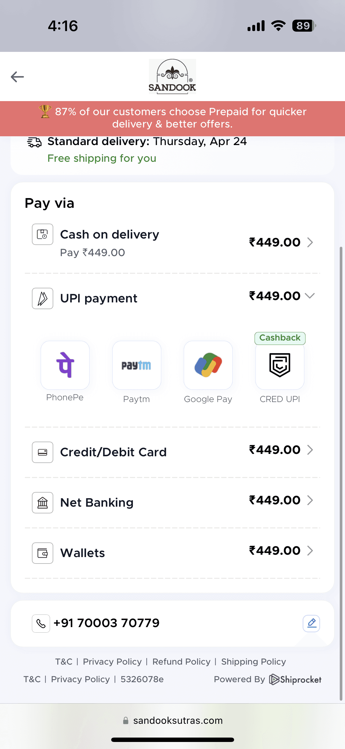
Preferred payment method are missing
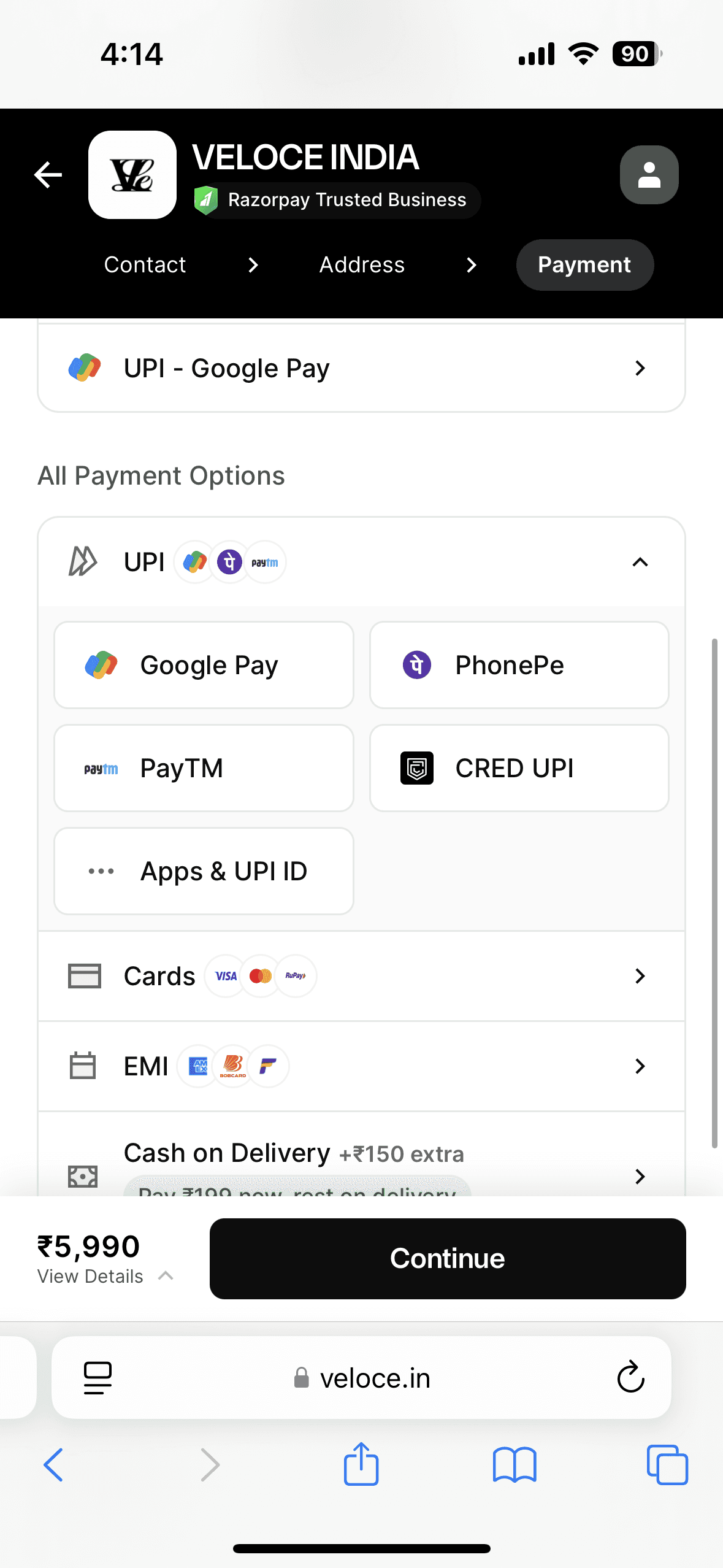
Inefficient UPI flow for the desktop users
Due to delayed cashflow seller prefer promoting online payments
Business Goals
What we set out to solve
E-commerce store often face transaction failures due to technical errors, confusing flow or lack or preferred payment method, etc. Our goal was to craft a experience with frictionless payment journey even when things go wrong.
01
Improvement in checkout completion rate by at least 0.1–0.5%
02
Increase the payment retry by 30% leading to successful payment
03
Increase UPI transactions across mobile and desktop by 15–20%
Old Design
New Redesign


Competitor Analysis
I collected these references to understand what industry is doing
when it comes to payment page

GoKwik
Discount nudges encourages users to choose online payment over COD
Multiple payment options visible at once
Extremely cluttered design makes it hard users to to make decision
Some of the text doesn’t have enough contrast
Razor Pay
Clean and focused layout with strong visual hierarchy well organised and easy to scan
Recommended options on top reduces effort for frequent users
Navigation is misleading. Once you select a payment method there’s no way to change it other than closing the whole transition
It’s not evident that tapping on UPI apps will open a new screen. Continue button is misleading since it doesn’t work when nothing is selected

Cashfree
Nudge to use online payment with social proof promotes users to use online payment although implementation could have been better
Price of the product is getting repeated in each payment method it created a cluttered design
Since there’s no final cta it is unclear what happens when user clicks on any of the payment method
Design Solutions
(01)
problem
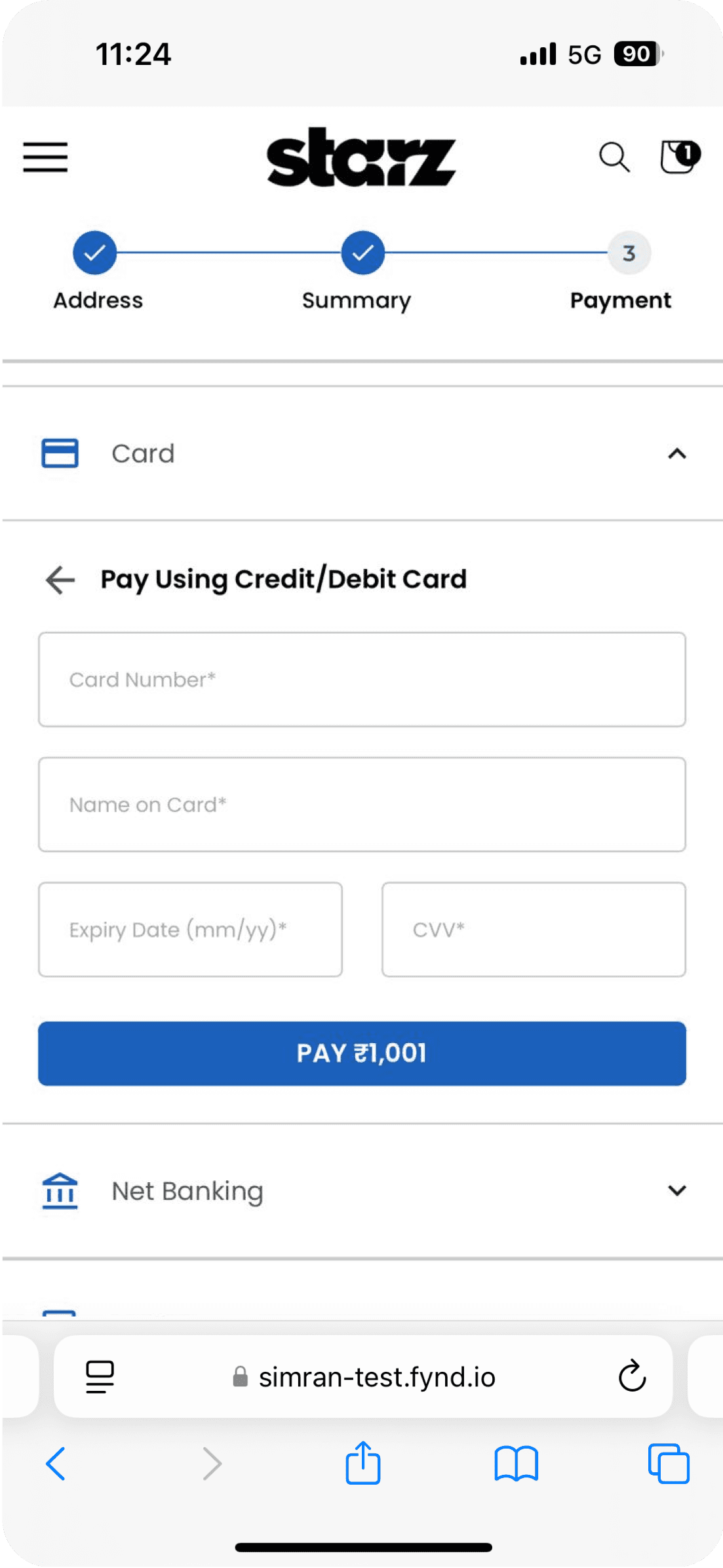
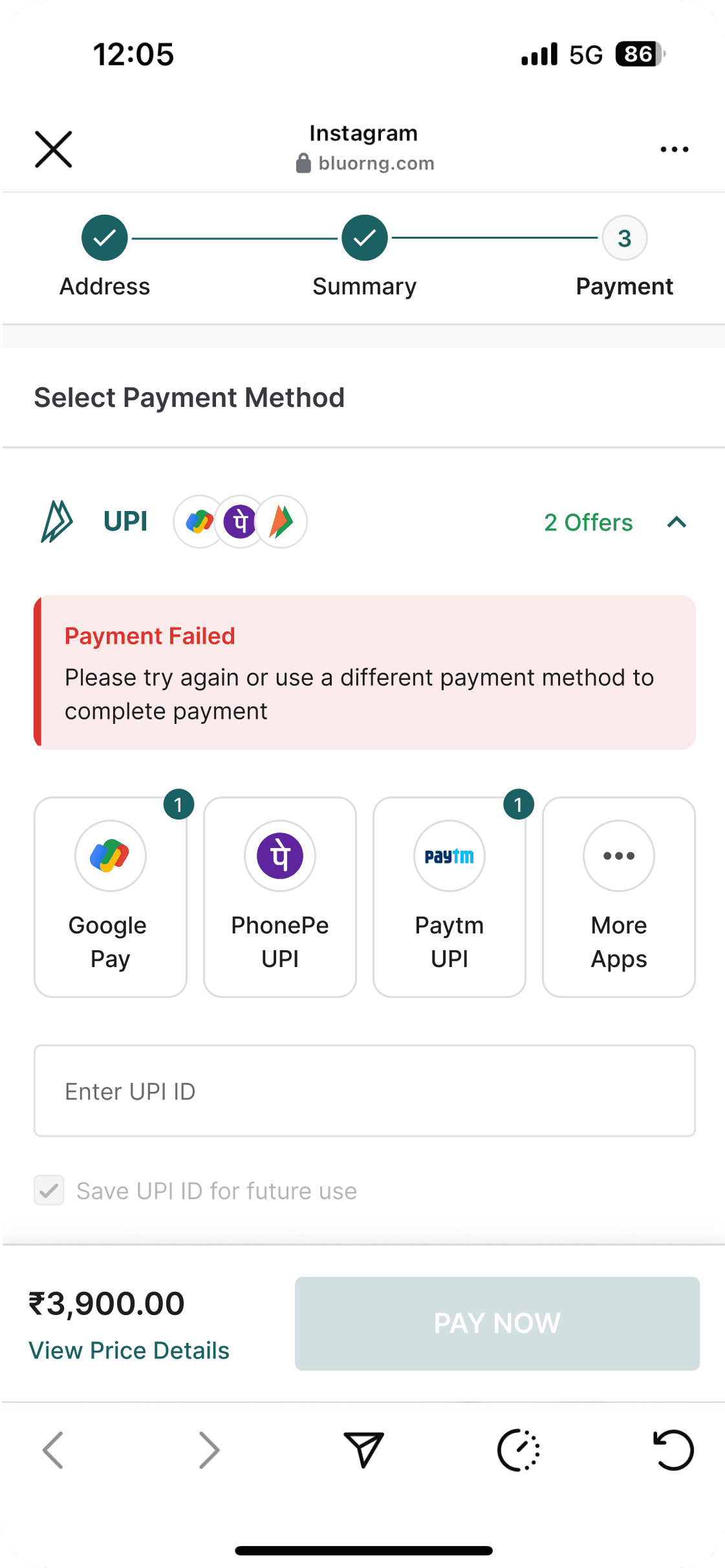
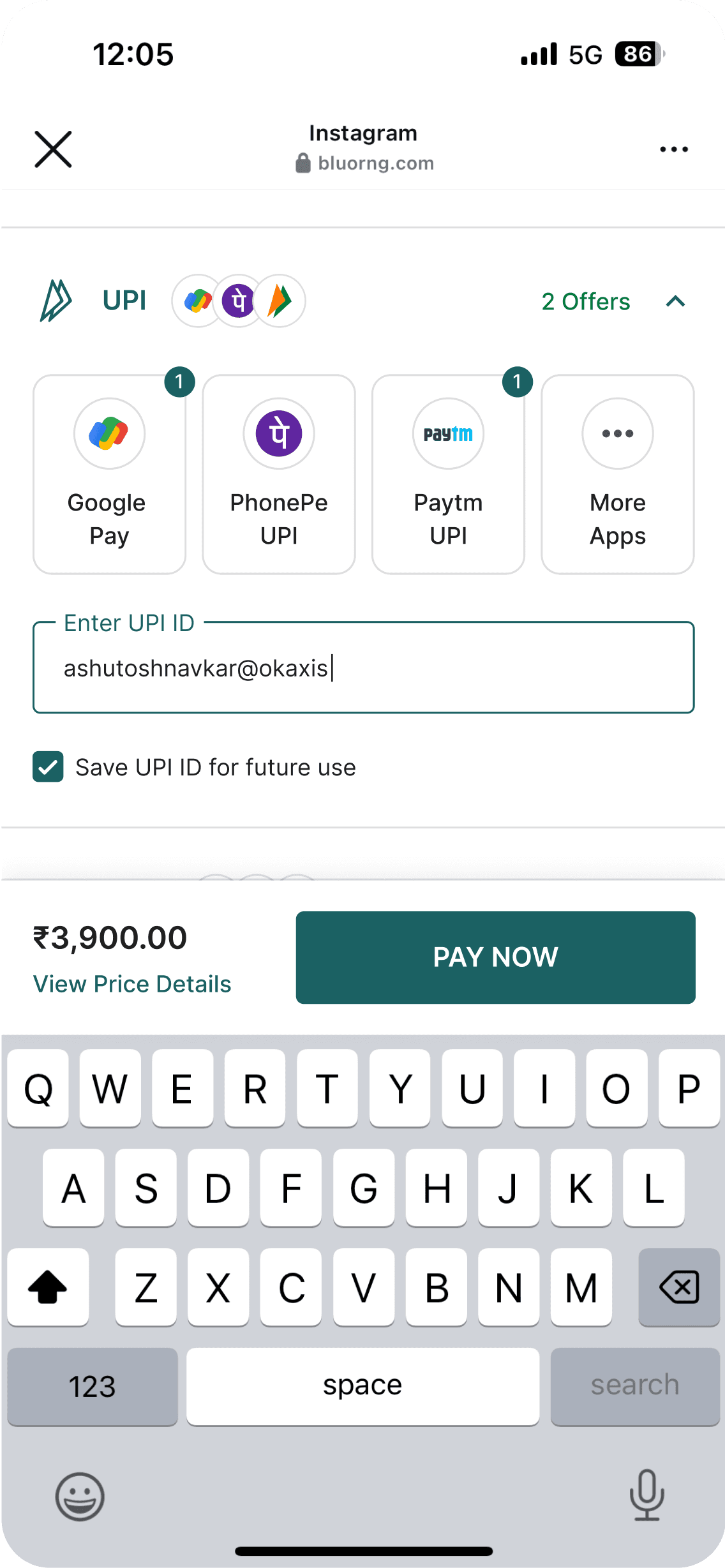
No real-time error validation for card & UPI payments
Since We Know 45% customers doesn’t retry a payment after falsely decline. Instead of showing a retry button we wanted users to quickly get back to the payment which is why we customer gets redirected back top payment step of checkout journey of same cart.
Inform user about the payment failure to avoid any confusion
Highlights alternative payment options to retry payment
Included payment processing page when the payment is not processed from the the bank
According to Baymard report to reduce the extra effort of select payment method most popular method should be selected by default
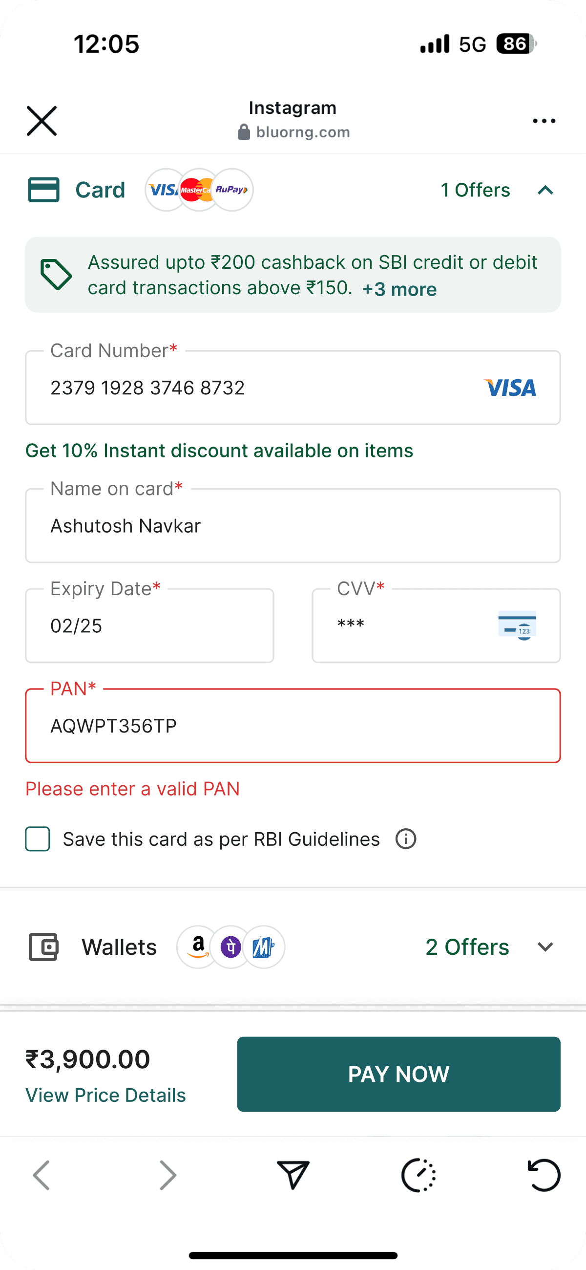
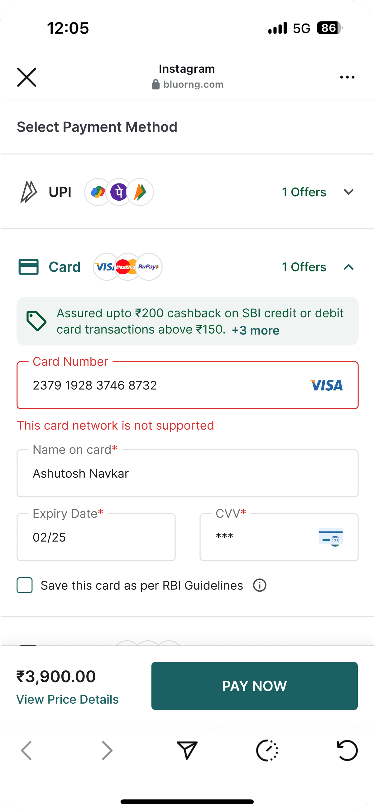
Earlier, users were only informed of payment failures after completing the entire form — even in cases like unsupported card networks. We addressed this by implementing real-time error handling for scenarios such as invalid card numbers, unsupported cards, and PAN requirements, helping users resolve issues upfront and reducing unnecessary failures.
problem
The retry payment option increased transaction recovery by 41%, reducing abandonment and boosting revenue retention by allowing users to easily retry failed payments.
(02)
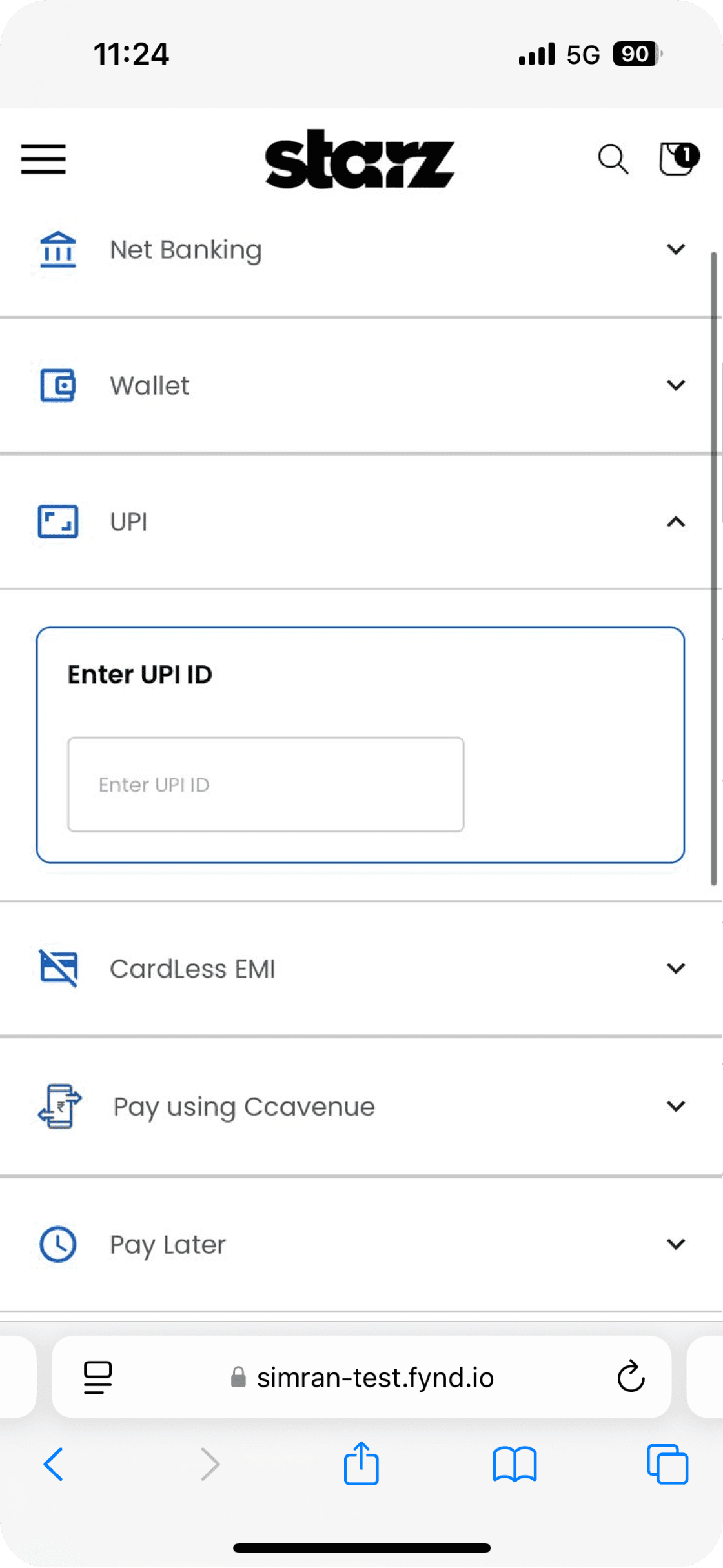
problem
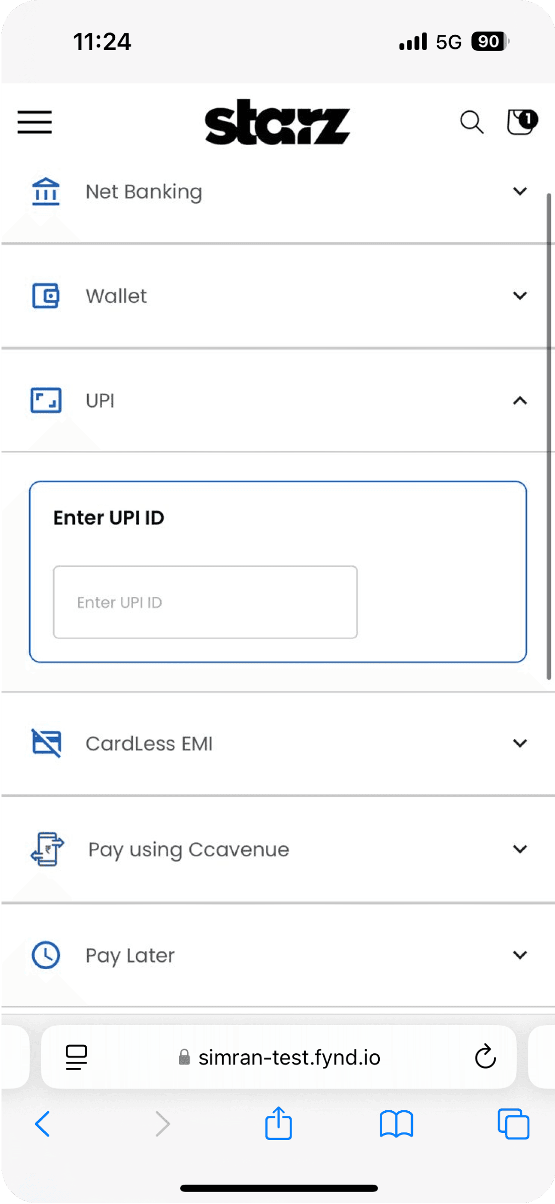
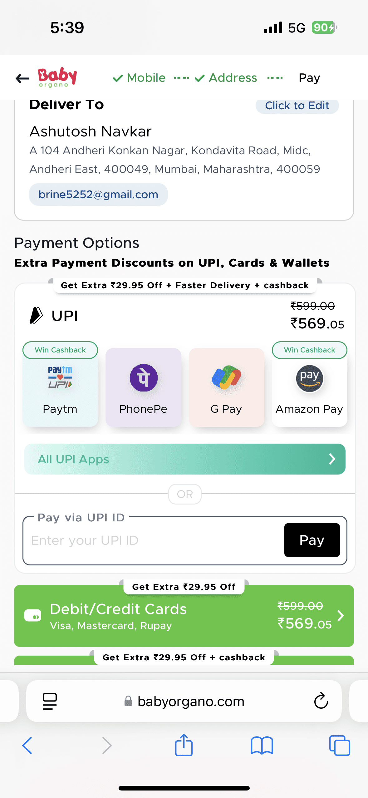
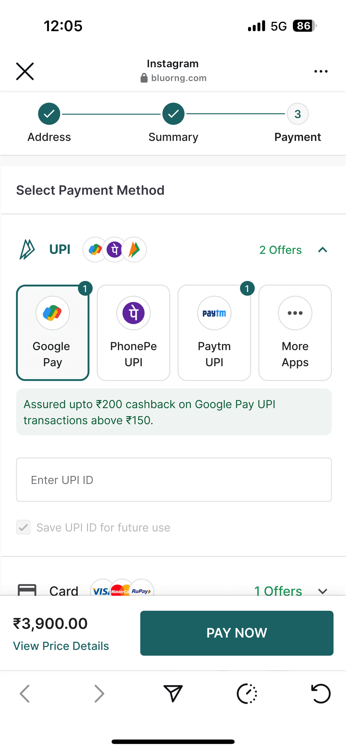
Missing UPI Intent support
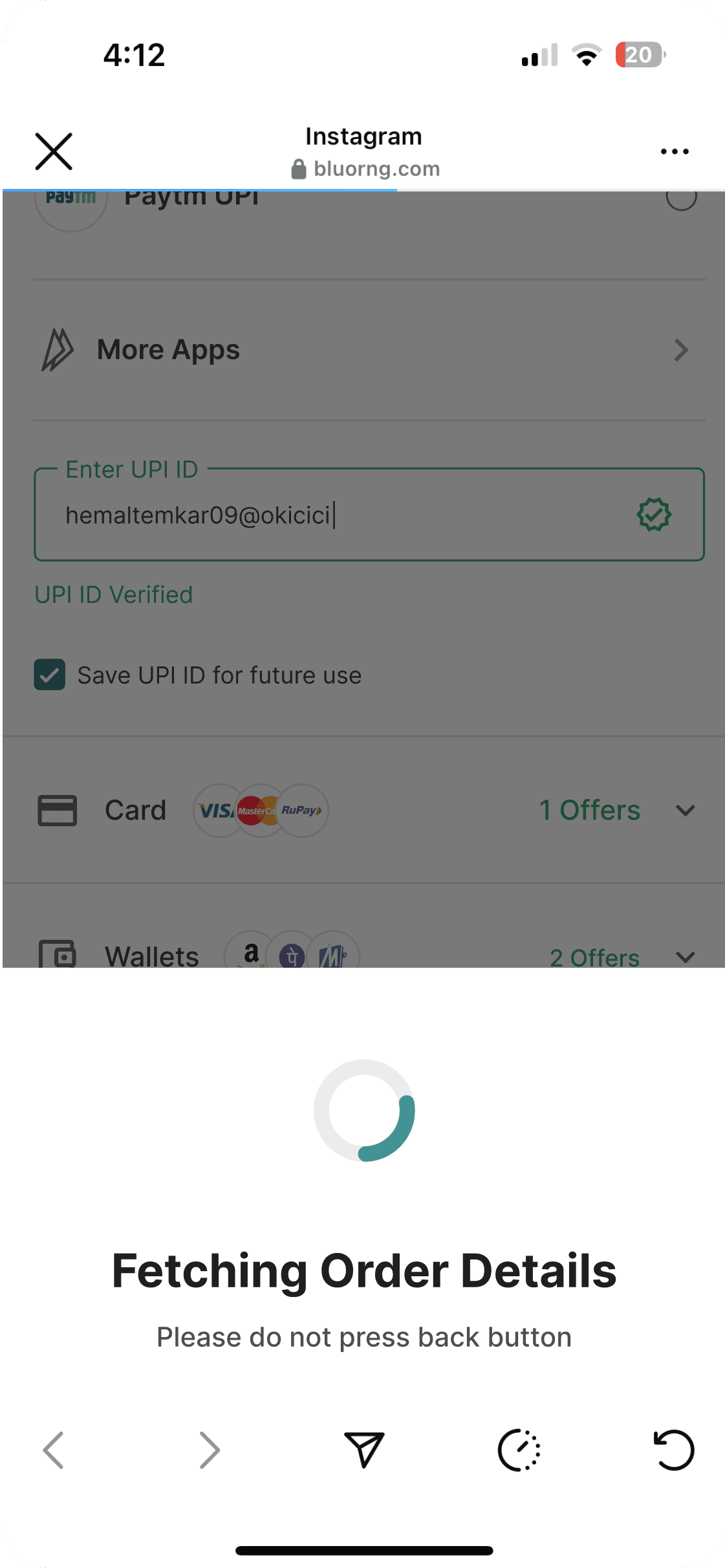
To speed up the payment step we used UPI Intent which customer to select installed UPI Apps in their mobile to make payment.
After looking at the data we found out amongst all UPI apps most preferred app is Paytm which amounts for 20.3% transitions then Google Pay at 19%
problem
UPI intent is easy way by which users can select the preferred UPI app and it would open the installed app on their phone. This reduces friction in the payment flow.
Old design
Improved version of the payment page

(03)
problem
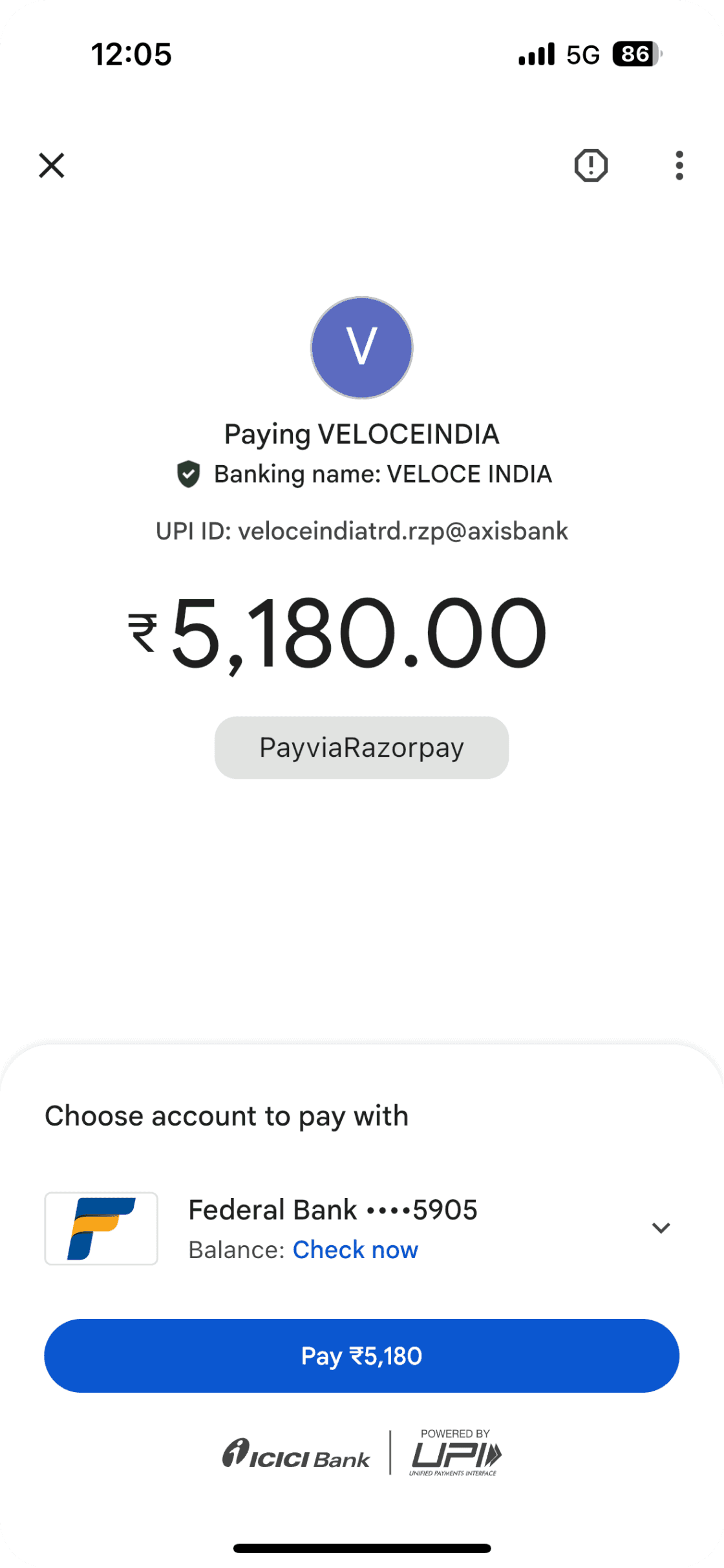
Desktop users lacked a seamless way to complete UPI payments
When shopping on Desktop, customer is able to pay using Dynamic QR code shown on website. Since Indians are so used to scanning QR and Paying it only make sense that every e-commerce website should also allow this
Showing the logo of the popular UPI apps builds trust and provide context to the QR code
QR code changes at regular intervals i.e. every 10 minutes. This regular change adds an extra layer of security, as even if someone took a photo of the QR code, it would quickly become obsolete and unusable.

(04)
problem
High reliance on Cash on Delivery was causing revenue delays and losses for sellers
Fixed other aspect of payment such as COD for which a lot of brands wanted to charge extra fees. Net-banking and wallet UX improvements
Boosting affordability by offering, no cost EMI's etc sweetens the deal for many a customer and highlighting these payment methods provides for more conversion
Additional charge on COD to manage the financial risks associated with this payment method while covering the extra operational costs involved in handling cash transactions. By being transparent about these fees, businesses can maintain customer trust while ensuring their profitability
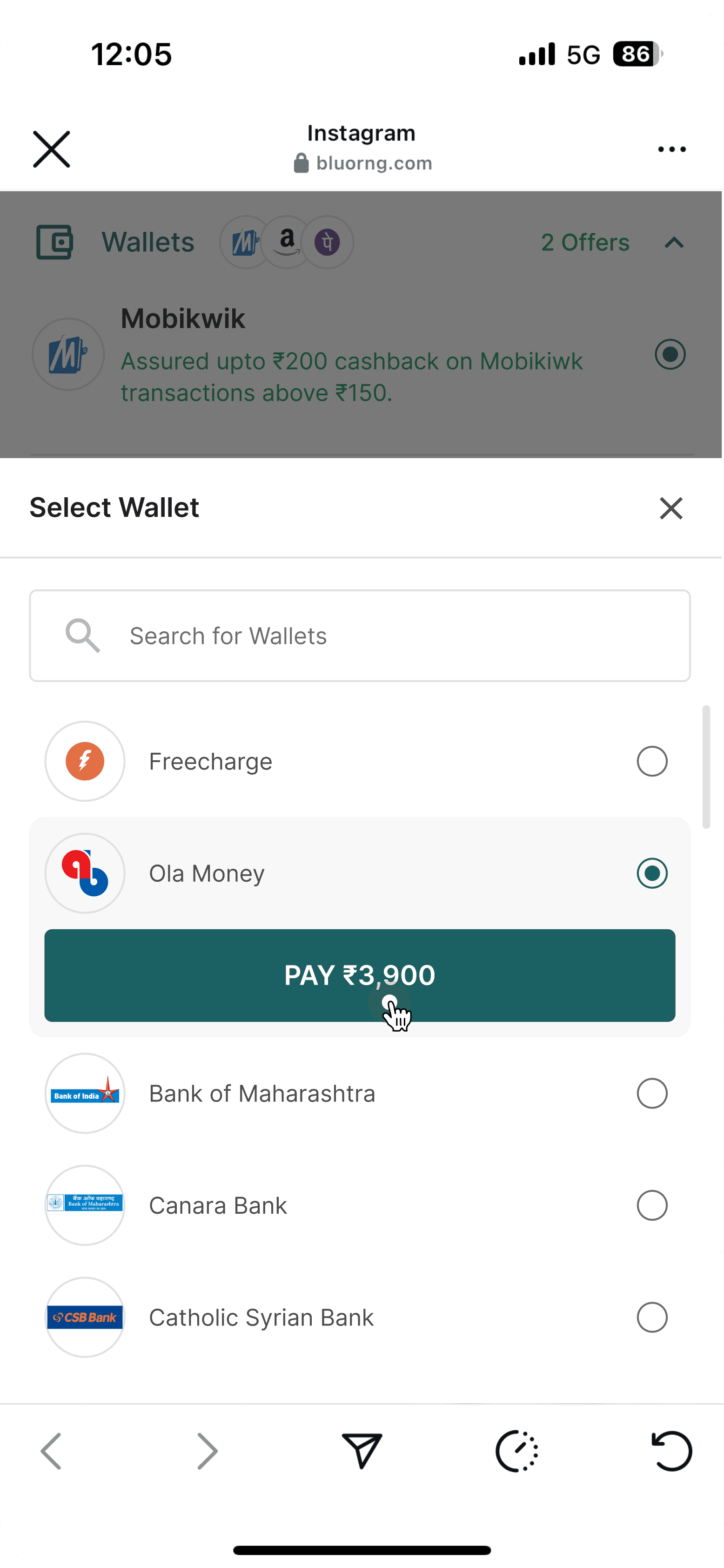
For more wallet & net-banking options a pop up gives a whole list of the options available along with the search functionality for easy finding the preferred option.


Results
Key outcomes from the redesign
Measurable outcomes, validating the impact of design decisions.
+0.13%
Improve checkout conversion rate
+26.4%
Retry-to-success conversion rate
+12.3%
UPI transactions
+8.2%
Task Success Rate
-20%
Avg. Time to Complete Payment
+18.4%
User Confidence Score
Learning
Reflections on my learnings
After completing this redesign I learnt a lot of new insights and a guide for anyone who’s trying to improve their payment page.
Select the most popular option by default
Ensure your website supports all major credit and debit card networks like Mastercard, Visa, and American Express. If certain cards are not accepted, communicate this clearly before redirecting users to the payment page.
Must have CVV less payment option for repeat customer as it has offers up to 3% higher Success Rate than with CVV saved card payment flow.
Provide EMI options to make the purchase more affordable
Implement advance payment feature for made to order items
Providing credit store option for refund helps sellers to retain revenue and increase repeat purchases
Thank You
LinkedIn: ashutoshnavkar